Wall Accents in Utah: How to Choose a Design That Actually Fits Your Home
One of the first things homeowners usually do when we start talking about an accent wall is pull out their phone.
They have a picture saved from Pinterest, Instagram, or somewhere else online, and the question is usually pretty simple: “Can we do something like this?”
Most of the time, the answer is yes.
But before I start studying the pattern in the picture, I start looking around the room. I look at the casing around the doors and windows, the height and style of the baseboards, the shape of the doors, the ceiling height, and the angles of the walls. I pay attention to where the vents, outlets, and light switches are located. I look at the furniture and think about where someone’s eye naturally goes when they enter the room.
That may seem like a lot of thought for a wall accent, but the pattern is only one part of the finished project. The larger goal is to make the wall feel like it belongs in that particular home.
A design can look great in a picture and still feel wrong when it is forced into a room with different proportions, different windows, and different architectural details. The room has to be part of the design process.
That is the difference between putting trim on a wall and creating something that looks like it was always supposed to be there.
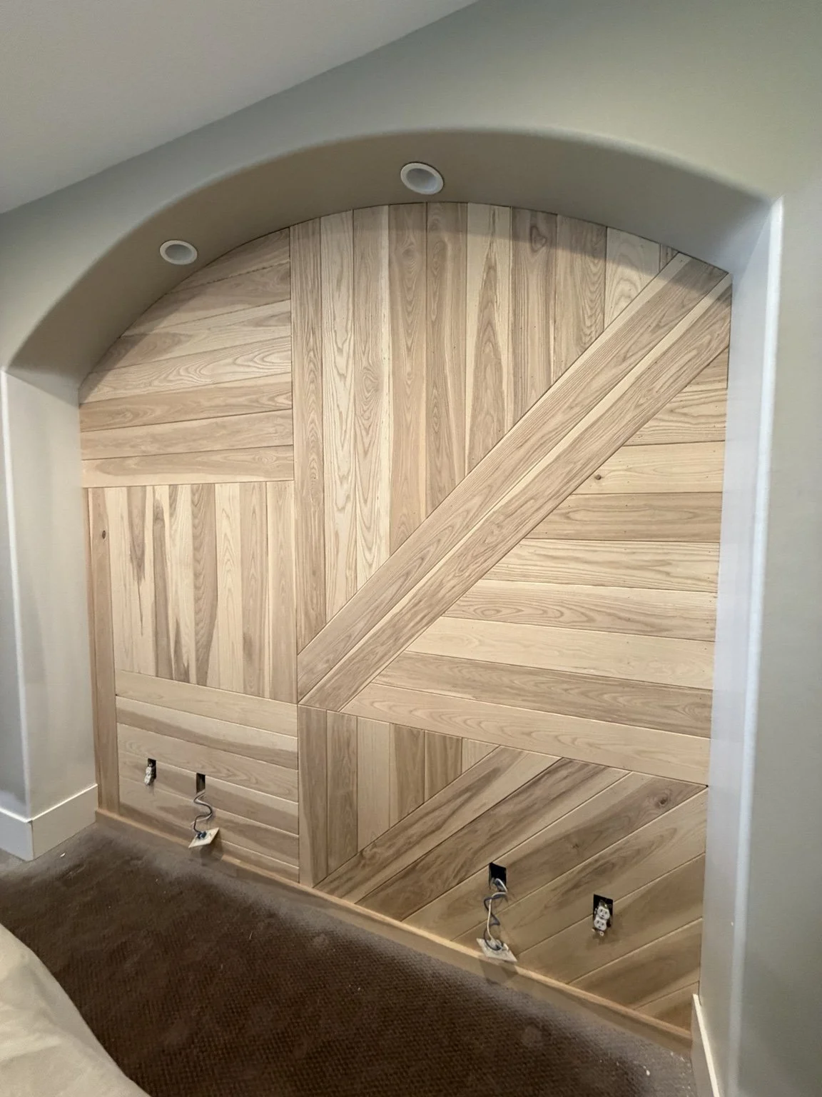
Custom Geometric Ash Wood Accent Wall
Every wall has its own challenges. This custom design was built to fit the home's arched opening, blending vertical, horizontal, and diagonal hardwood planks into one seamless feature that feels like it was part of the original architecture.
Why Wall Accents Work Well in Utah Homes
Homes throughout the Salt Lake Valley cover a wide range of ages and styles. There are newer homes with open layouts and simple builder-grade trim, older homes with unique corners and settling walls, and custom homes with architectural details that can become part of a much larger design.
A wall accent can work in all of those settings, but not always for the same reason.
In a newer home, it can give a plain room more character without requiring a major remodel. In an older home, it can help bring existing features together or give new purpose to a wall that never looked quite finished. In an office, it can make the room feel more established. In an entryway, it can make a small area feel intentional instead of forgotten.
It is also one of the more direct ways to change the appearance of a room without adding a large piece of furniture or rebuilding the space. Vertical lines can make a wall feel taller. Horizontal lines can make a room feel wider. Picture frame moulding can give a flat wall more depth, while shelving or built-ins can add function along with visual interest.
There is no single accent-wall style that works for every Utah home. The right answer depends on the room, the homeowner, and what the space needs to accomplish.
I Start by Reading the Room
When I walk into a room, I usually start by looking at the existing finish work.
If the home has simple square casing and clean doors, a straightforward board-and-batten pattern may fit naturally. If the home has more detailed moulding or inset door panels, picture frame moulding may connect better with what is already there.
The existing trim gives you clues. It helps determine whether the new work should be bold, simple, traditional, modern, or somewhere in between.
Then I start looking at the shape of the room.
Is it a square, blocky room, or does it have angled walls? Are there 22½-degree corners, 45-degree turns, bay windows, bump-outs, or changes in the ceiling? Those details can completely change the layout.
One project had several angled walls and 22½-degree corners that needed to be wrapped. Instead of stopping the trim at a hard edge, we carried the pieces around the corners with mitered wedge pieces.
The lower skirt board wrapped the angle. The vertical battens wrapped it. The upper face frame and cap wrapped it as well.
That approach gave each outside piece a leg on both sides of the corner. No matter which direction you looked at the wall from, the trim appeared complete. Had we ignored the corner and simply divided the front wall into evenly spaced sections, one side could have looked noticeably larger or unfinished.
That job is a good example of why the room has to influence the design. Equal spacing on paper does not always create visual balance in the real room.
Suggested photo placement: Use the angled wainscoting wall here, with a close view showing how the lower rail, vertical trim, and upper cap wrap around the 22½-degree corner.
Planning Is Where the Project Is Won or Lost
Wall accents can look straightforward after they are finished. What homeowners do not always see is the amount of planning required before the first piece is nailed to the wall.
We start with a laser and establish level reference lines. We measure the full wall and check its height in several places. We look for corners that are out of plumb, walls that bow, and floors or ceilings that are not level. We locate studs and consider what may be behind the drywall, including plumbing and electrical lines.
Then we begin laying out the pattern.
That layout has to account for more than the total width of the wall. We have to think about the actual width of every trim piece, the openings between them, the placement of outlets, and the way the pattern will land against corners and existing casing.
I learned how quickly small errors can become large ones on a project where my measurements and the pieces I was cutting were not staying consistent. Each section was losing about one-sixteenth of an inch.
One-sixteenth does not sound like much. It is easy to think it will disappear once everything is installed and painted.
But that error continued across the wall. By the time I reached the end, some of the boxes had drifted by roughly half an inch to three-quarters of an inch compared with the spacing where I started.
That changed the way I approach these jobs.
Now I stop and check the layout as it develops instead of assuming the measurements will continue working because the first few pieces look right. I compare the actual material with the plan because trim pieces can vary slightly in thickness and width. I step back from the wall often, especially before reaching the point where removing installed pieces becomes difficult.
It is easy to see the light at the end of a project and start focusing on finishing it. That is usually when mistakes begin to compound.
A little more time spent checking the first pieces can prevent an entire wall from needing to be reworked.
The Loose-String Problem
The way the eye sees finish work is interesting.
Someone may not be able to tell you that a box is three-quarters of an inch narrower than the others or that one line is slightly out of level. They may not know why something feels wrong.
They will still see it.
I compare it to a loose string on a good shirt. The rest of the shirt can fit perfectly, but once your eye catches that loose string, it is hard to stop looking at it.
An accent wall can work the same way. One unusual gap, one board that lands awkwardly against an outlet, or one line that almost matches a window can become the first thing someone notices.
That is why the goal is not always perfect mathematical symmetry. The more important goal is visual balance.
A wall can be divided into equal sections and still look wrong if those sections ignore the windows, the furniture, or the architecture of the room. Another wall may have slightly different measurements on each side, but if the lines connect naturally with the surrounding features, the finished room can feel balanced.
I do not want the eye to catch one piece like a loose string. I want it to move through the room without stopping on something that looks accidental.
Existing Features Can Guide the Whole Design
Some of the best accent-wall layouts come from using lines that already exist in the room.
A window height may become the upper line for the wall treatment. A chair rail may follow the height of nearby furniture. The lower skirt board may need to move slightly so it does not leave a small, awkward sliver around a heating vent.
These adjustments may seem minor, but they have a major effect on how the room feels.
Suppose there is a vent near the bottom of the wall. If the lower trim lands just below it and leaves a narrow strip of wall between the two, that strip can look like an afterthought. Raising the skirt board so the vent is incorporated into the layout may create a much cleaner result.
The same idea applies to windows. When the main horizontal line of an accent wall continues through the height of nearby windows, the room begins to feel connected. The wall treatment is no longer operating by itself.
Suggested photo placement: Use the vertical batten wall with the three windows here. The image supports the point that the trim layout should work with the window locations rather than treating them as interruptions.
Furniture can also guide a design. If a couch wraps a room in an L shape, the height of the wall treatment may be set so the main line runs consistently above it. That can help the wall, furniture, and room feel like parts of the same plan.
These are the projects that often produce the strongest reaction when they are finished. The homeowner may not point to one exact detail, but the room feels complete because the major lines are working together.
Working With Walls That Are Not Perfect
Many wall accents are installed in homes that are 10, 20, or 30 years old. It is normal to find walls that are not perfectly straight.
Drywall can bow. Framing can move. Corners can lean. Floors and ceilings may have slight changes in height.
Finish carpentry cannot make every part of the structure perfect, but the design can be adjusted so those imperfections are less noticeable.
For example, imagine a bowed wall where the design calls for a three-inch border piece. If that border has to be trimmed by a quarter inch in the center to follow the wall, the change may be easy to see because a large percentage of the piece has disappeared.
Using a wider border, perhaps six or seven inches, can make that same quarter-inch adjustment much less noticeable. The piece still has enough width and visual weight that the change blends into the wall.
That is part of planning for the space instead of forcing the original sketch onto it.
A wall can also be out of plumb in two different directions. In that situation, following one edge exactly may make the trim look crooked compared with the ceiling, floor, or windows. Sometimes the best approach is to blend the line between those reference points so the eye does not immediately recognize the difference.
Finish carpentry is not always about proving which part of the house is out of level. It is about making the finished work look right within the room that actually exists.
Pinterest, Instagram, and AI Are Starting Points
I like it when homeowners bring inspiration pictures.
Those pictures give us a common place to start. They show the general style, spacing, color, and level of detail the homeowner is drawn to.
More recently, many of the inspiration images online have been created or altered with artificial intelligence. I am not against that. Some of those concepts are creative and can push a project in a direction that neither the homeowner nor the carpenter would have considered at first.
The challenge is translating the image into something that works in the real world.
An AI image may show a shelf with no visible backing, cleat, or method of attachment. In the image, it appears to float while holding shoes, books, or other heavy items. In a real home, that weight has to transfer into studs or solid backing.
I worked on a shelving and shoe-rack design that had this exact problem. The homeowner’s reference image had a very clean appearance, but it did not show how the shelving was supported.
We were still able to create the overall look they wanted, but we added pieces that were not obvious in the original image so the shelving would remain secure and would not sag or move over time.
That is not a failure to copy the picture. It is part of turning a design idea into a finished product that is safe and durable.
There may also be construction methods I have not personally used that could achieve a certain appearance. I try not to dismiss an idea just because the method is not immediately obvious. The better question is whether the design can be built responsibly within the homeowner’s budget, wall construction, and expectations.
The picture should start the conversation. It should not end it.
How Decorative Trim Is Secured
Decorative wall trim does not usually carry a structural load, but it still needs to remain tight to the wall.
When possible, pieces are fastened into studs or backing. That is especially important when the project includes shelving, cabinets, or anything expected to support weight.
For lighter decorative trim, we typically use adhesive along with finish nails. When there is no stud directly behind the piece, nails can be driven at opposing 45-degree angles. This is sometimes called butterfly nailing.
The opposing nails help pinch the trim against the drywall while the adhesive cures. Once the adhesive has set and the joints have been filled, caulked, sanded, and painted, the trim should remain stable under normal use.
That approach is appropriate for decorative pieces that are not going to be bumped, pulled on, or loaded with weight.
It is not the method I would depend on for a 16-inch-deep shelf carrying books, shoes, or household items. In that situation, the support needs to reach framing or proper backing.
The fastening method should always match the job the finished piece is expected to perform.
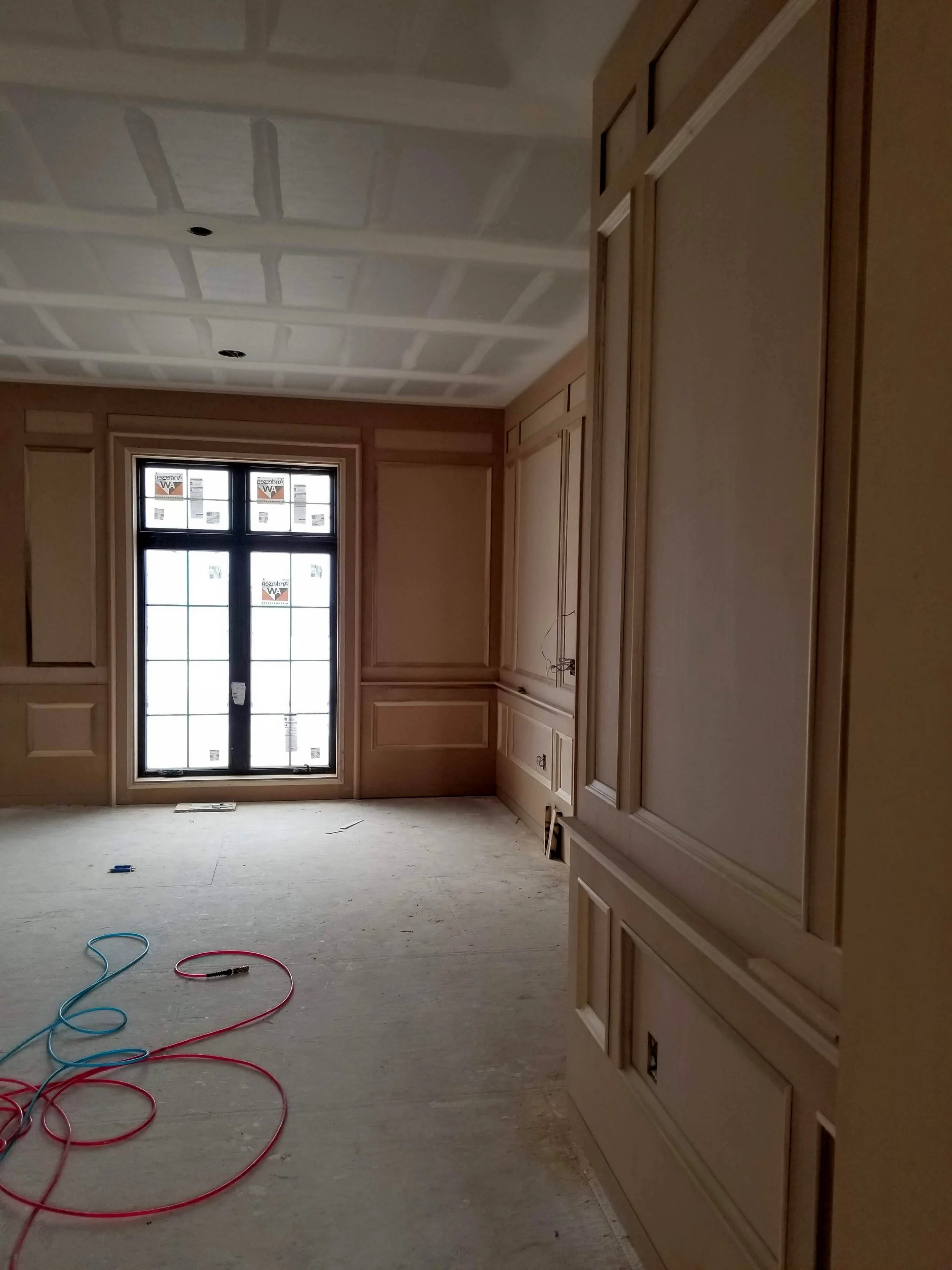
Planning the Details Before the Finish
Before paint and caulk hide the work, every piece has to fit the room. Careful planning around the windows, ceiling, and wall layout is what makes the finished space feel balanced instead of pieced together.
Popular Wall Accent Styles in Utah
There are several styles that continue to work well in homes throughout Salt Lake City and the surrounding Utah areas. The important part is not choosing the most popular style. It is choosing the one that connects with the room.
Picture Frame Moulding
Picture frame moulding works well in dining rooms, offices, hallways, entryways, and staircase walls. It can be simple and traditional or combined with other trim details for a more substantial appearance.
The challenge is usually the layout. Stairs, angled corners, outlets, and changing ceiling heights can make equal spacing impossible.
A staircase project is a good example. The boxes cannot all be the same size because the lower line follows the stair angle while the upper portion may stay level. The goal is to make the changes look intentional rather than forcing identical measurements where they do not fit.
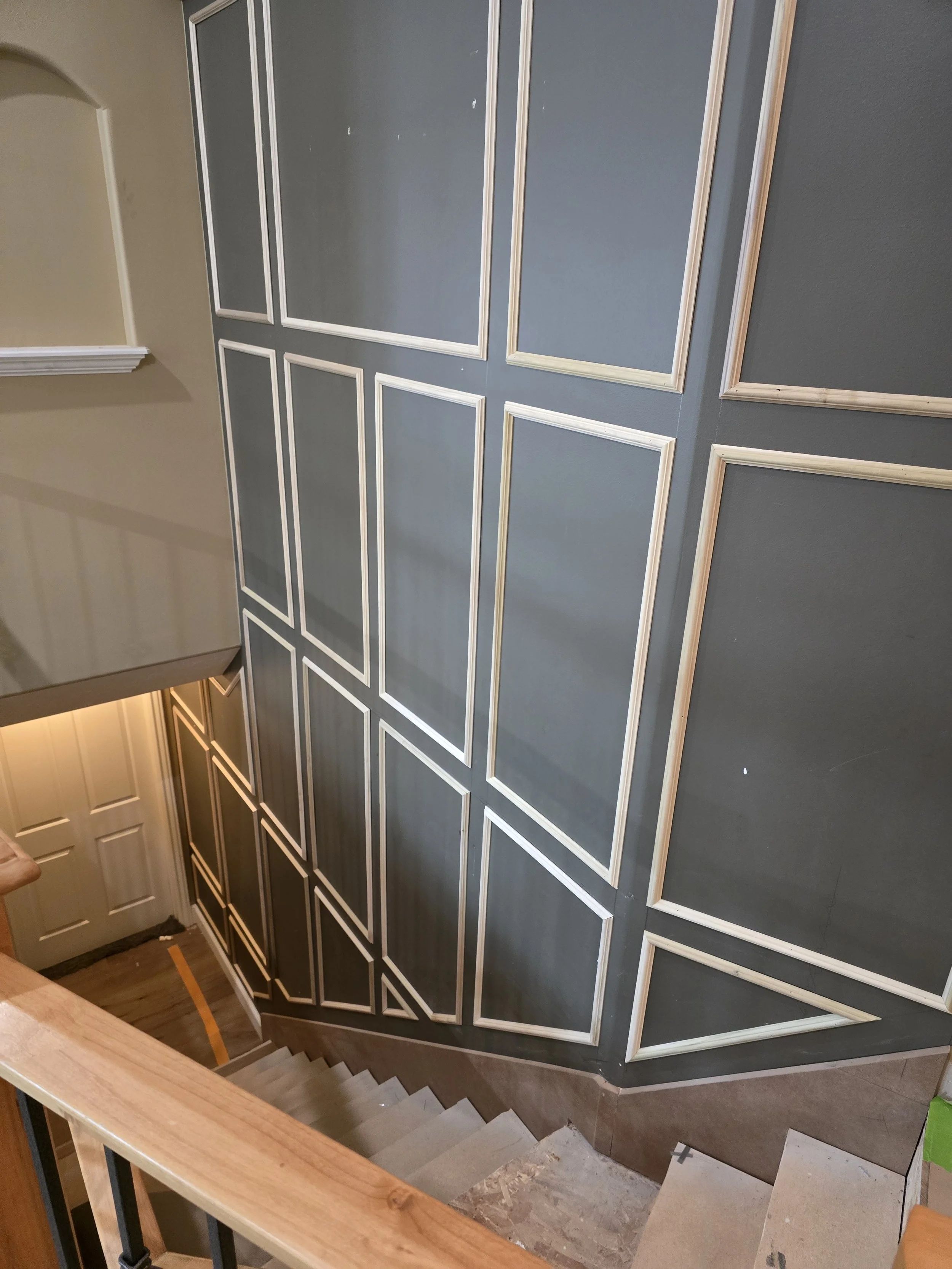
Designing Around the Architecture
Staircases rarely allow for perfectly equal panels. Instead of forcing symmetry, each section was adjusted to follow the changing angles while keeping the entire wall visually balanced from top to bottom.
Board and Batten
Board and batten can range from a simple half-wall treatment to a full-height design with detailed caps, skirt boards, and wrapped corners.
Vertical battens can help a room feel taller, but spacing has to be considered alongside the windows and door openings. Placing battens by measurement alone can leave narrow pieces beside windows or produce awkward gaps at each end of the wall.
A good layout uses the room’s features as part of the pattern.
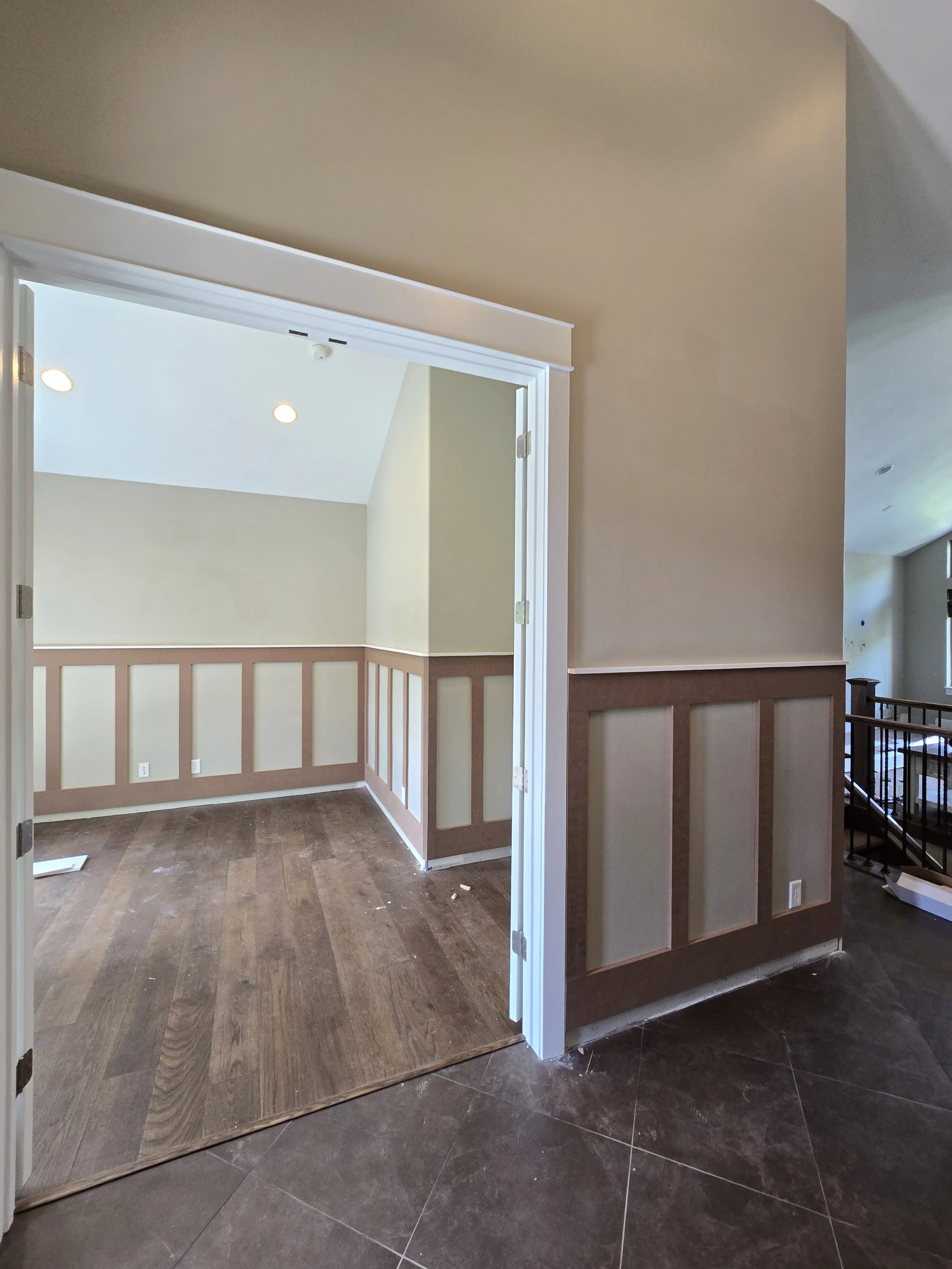
Simple Doesn't Mean Ordinary
Not every accent wall needs an intricate pattern. Clean, consistent wall paneling can add depth, define a space, and create a finished look that flows naturally from one room to the next.
Horizontal Shiplap
Horizontal shiplap adds texture without requiring a complicated pattern.
It can be used behind a television, around a fireplace, or across an entire room. Because the lines run horizontally, it can make a wall feel wider and can provide a clean background for furniture, artwork, or other focal points.
The installation still requires attention to outlets, corners, and the top and bottom termination points. A simple pattern does not mean the layout is unimportant.
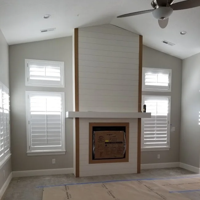
Making the Fireplace the Focal Point
A fireplace naturally draws your attention. Extending the shiplap to the vaulted ceiling and framing it with clean trim creates a feature that feels connected to the architecture instead of competing with it.
Fireplace Feature Walls
A fireplace already has a strong visual position in most rooms. The surrounding wall should support that focal point rather than compete with it.
Shiplap, herringbone patterns, mantels, beams, and custom trim can work together, but those elements need a common set of lines and proportions. When each one is added separately without considering the others, the wall can become too busy.
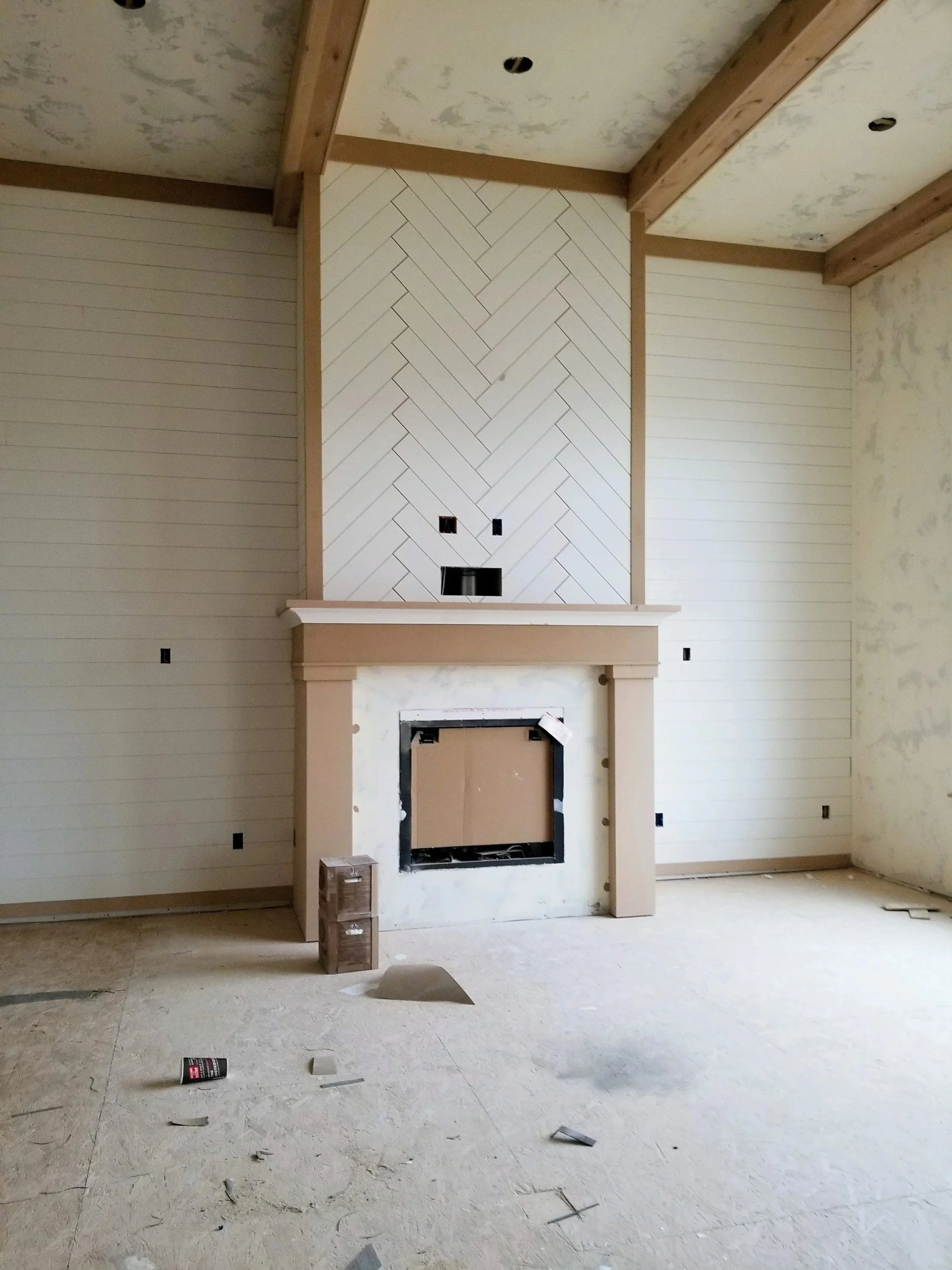
Bringing Multiple Elements Together
The strongest feature walls aren't built around one detail. By combining herringbone, shiplap, exposed beams, and a custom mantel, every element works together to create a fireplace that feels like part of the home's original design.
Wainscoting and Wrapped Corners
Wainscoting can help define hallways, stair landings, dining spaces, and larger rooms. In homes with angled walls, wrapping the lower rail, vertical members, and upper cap around the corners gives the treatment a continuous appearance.
Stopping every piece at the front edge may be easier, but it can make the corner look unfinished from another direction.
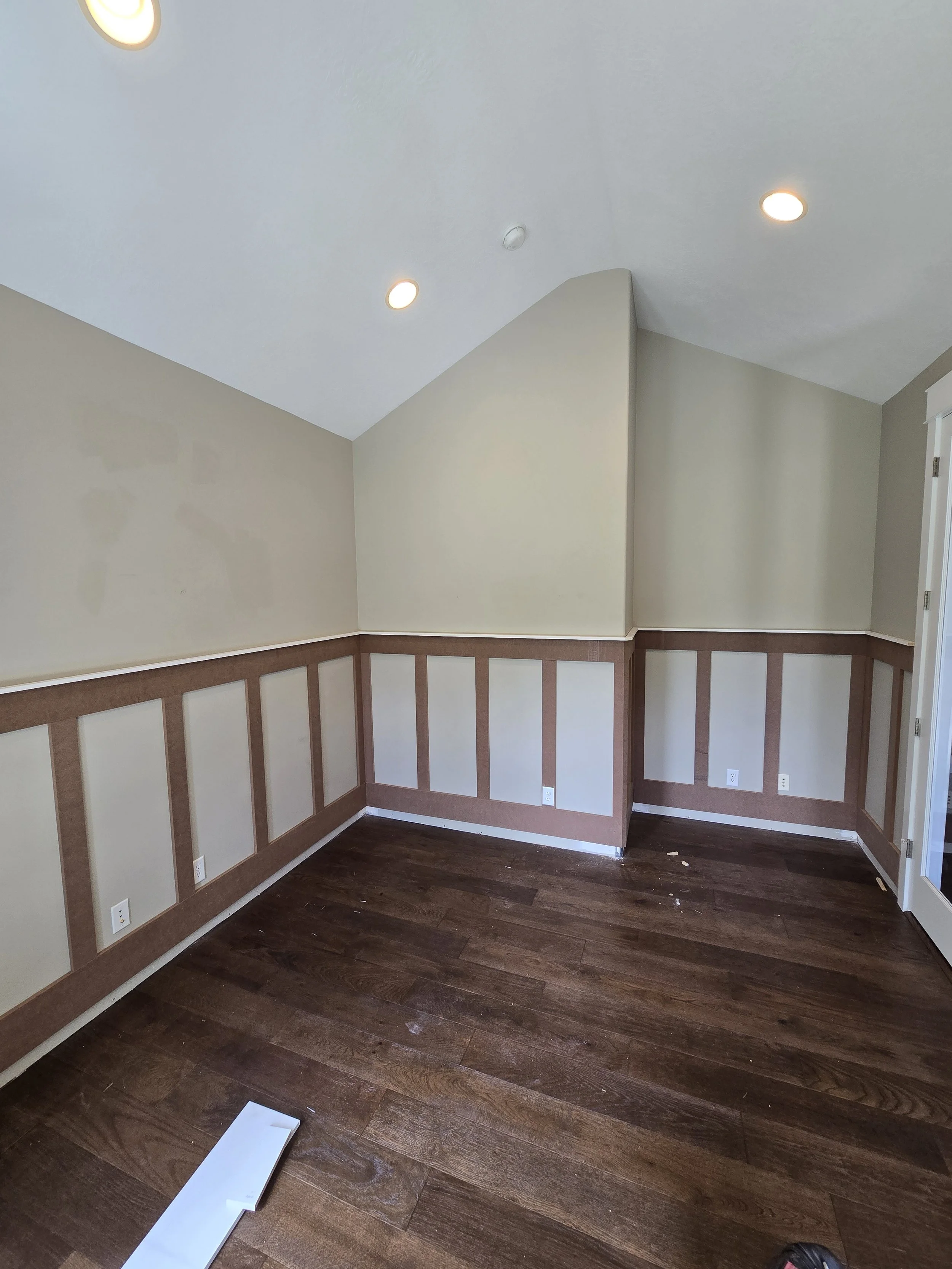
Adding Character Without Overcomplicating the Room
Not every room needs an elaborate feature wall. Simple board and batten paneling adds depth, defines the space, and gives the room a finished look without becoming the center of attention.
Ceiling Details
A room’s walls do not exist separately from its ceiling.
Coffered ceilings, beams, and other overhead details can provide layout lines that continue down the walls. They also affect how much detail the room can handle. If the ceiling is already highly detailed, the wall treatment may need to be quieter.
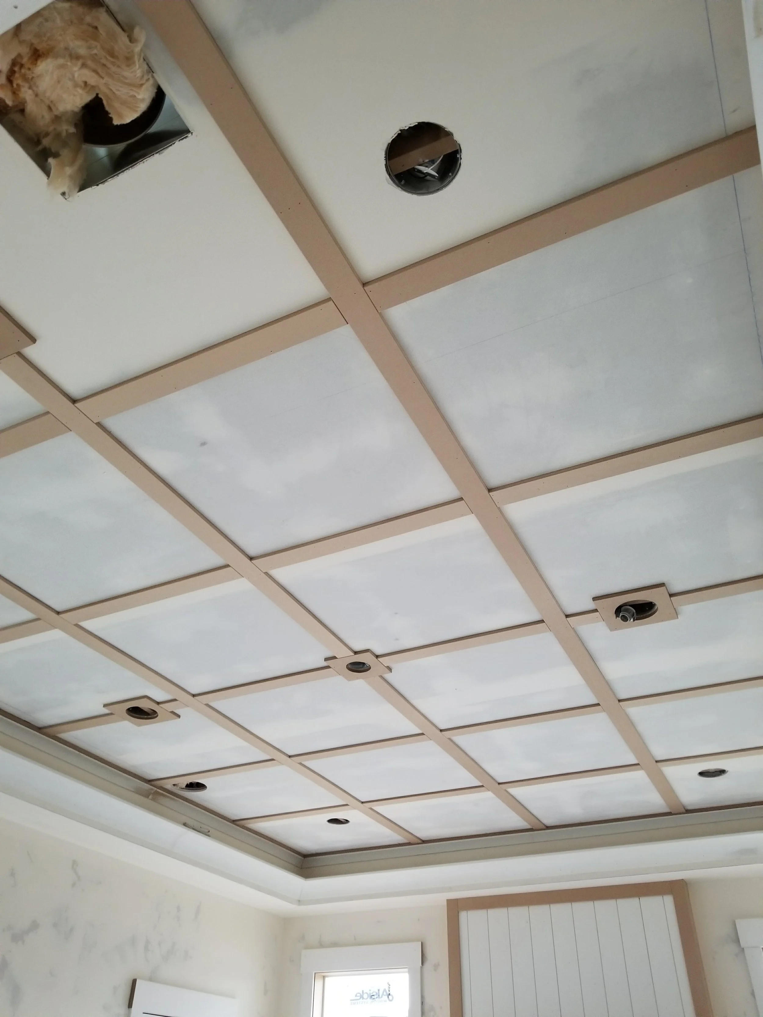
The Ceiling Deserves the Same Attention as the Walls
Great finish carpentry doesn't stop at eye level. Careful ceiling layouts create another layer of depth and help tie the entire room together while working around lighting, HVAC, and the home's structure.
Sometimes an Accent Wall Is Not the Best Use of the Space
I do not normally talk homeowners out of doing something personal in their house. I think there is room for a lot of creativity, and the right design is often the one that makes the home feel more connected to the people living there.
But sometimes the conversation leads to a different solution.
One homeowner originally wanted a small accent wall near her entryway. The wall was about four feet wide and sat inside a one-foot-deep recessed area.
It could have held a decorative trim pattern, but after talking with her, I learned that she had children, grandchildren, family pictures, and keepsakes she wanted to display.
We discussed adding shelves with face framing instead.
The shelves made better use of the recessed area, and they helped the hallway feel more even instead of leaving a blank bump-out on one side. More importantly, the homeowner gained a place where she could see photographs and personal items every time she entered the house.
That was a better result than installing trim simply because the original request was for an accent wall.
The purpose of the conversation is not to replace the homeowner’s idea with mine. It is to understand what they are hoping to get from the space and then develop the idea together.
Sometimes that means board and batten. Sometimes it means picture frame moulding. Sometimes it means shelving, face-frame cabinetry, or another feature that serves the family better.
What Experience Changes
Ten years ago, I may have looked at some of these rooms and chosen a simple chair rail or a basic pattern.
Experience changes what you are willing to attempt, but it also changes what you notice.
After seeing different carpenters approach accent walls in different ways, repairing mistakes, and sometimes removing entire sections that did not look right, I have become more comfortable taking on complicated designs.
That does not mean adding detail just to prove that the work is difficult. It means knowing when a more developed design can improve the room and having the experience to execute it.
Woodworking has a way of showing every step that came before the finished product.
Everything begins as raw material. The result depends on the plan, the measurements, the cuts, the assembly, the sanding, and the finish. Each step has to be complete before moving to the next one.
A project can turn into something better than the original idea when the time and thought are put into it. It can also turn out poorly when steps are rushed or ignored.
That is one reason I continue to enjoy woodworking. The finished project records the decisions that were made along the way.
Is an Accent Wall Worth the Cost?
There are several ways to answer that question.
A well-designed wall accent can add visual value to a home without requiring a major structural change. It can make a room feel taller, wider, deeper, or more finished. It may also help a home stand out when it is eventually listed for sale.
But I would not recommend choosing a wall accent based only on resale value.
The stronger reason is what it can do for the people living in the home now.
Maybe you want family pictures to feel like part of the room instead of being placed randomly on a blank wall. Maybe you want an office to feel more established. Maybe you have lived in the home for several years and want the room to look different without replacing everything inside it.
A wall accent can highlight the things that are already meaningful in the room. It can create a background for furniture, artwork, a fireplace, or family photographs. It can also make a space feel more deliberate without adding bulk or taking away floor space.
That is when I think it is worth doing.
The project should not simply add wood to a wall. It should give the room something it was missing.
Final Thoughts
The best wall accents do not begin with a pattern. They begin with a conversation and a careful look at the room.
The inspiration photo matters, but so do the windows, vents, doors, trim, outlets, corners, furniture, and the way someone enters the space. The layout has to account for the home that actually exists, not the perfectly square room shown in a rendering.
Small details matter because the eye notices them quickly. A sixteenth of an inch can become three-quarters of an inch across a long wall. A narrow strip beside a vent can become the loose string that someone sees every time they enter the room. A corner that is ignored from one direction can make the entire treatment feel unfinished.
Good planning prevents those problems. It also creates opportunities to use the room’s existing lines in a way that makes the finished work feel connected.
That is what I am looking for when I stand back from a completed project.
I do not want one board, one joint, or one pattern to demand all the attention. I want the wall to support the rest of the room. I want the lines to make sense. I want the homeowner to feel that the design was created for their space, not copied and forced into it.
The trim does not need to be the first thing someone notices.
The room should simply feel right.